Wednesday, 10 November 2010

Lifedrawing Update

Date: 9th November 2010
Model: Jane
Time: 1 Hour 15 Minutes
Description: A third drawing done using charcoal, I think this was my best piece of the evening


Date: 9th November 2010
Model: Jane
Time: 30 Minutes
Description: Second pose, drawn using charcoal. I liked this pose the most because I enjoy practicing drawing from this perspective.


Date: 9th November 2010
Model: Jane
Time: 45 Minutes
Description: The first drawing of the evening. I think it went well just didnt get the face done, stomach didnt come out as planned either. Still I dont think its that bad...


Date: 26th October 2010
Model: Jane
Time: 1 Hour
Description: Negative Space:- I tried a slightly different approach this time. I prefer it to the first peice, but i still dont like this "negative space" stuff.


Date: 26th October 2010
Model: Jane
Time: 40 Minutes
Description: Negative Space:- I didnt really understand this exercise nor did i enjoy it. I did what I thought was right but I think it was wrong by the looks of everyone else's drawing which all looked similar.


Date: 12th October 2010
Model: Becky
Time: 30 Minutes
Description: A free lesson to draw how you like. I think the drawing is alright, but it doesn't look like Becky. This is more of a filled out Becky.


Date: 12 October 2010
Model: Becky
Time: 30 Minutes
Description: Body Composition Judged On Distance:- Here I focused more on getting the measurements right rather then the likeness. The drawing came out rather small, but the proportions were about right.


Date: 12th October 2010
Model: Becky
Time: 5 Minutes
Description: A quick 5 minutes pose to get the basic shape.


Date: 12th October 2010
Model: Becky
Time: 1 Minute
Description: 3 poses drawn in one minute each. This was a speed exercise working on blocking out the main shape before you go to add detail. (I went over them in Photoshop because they were drawn very lightly)


Wednesday, 3 November 2010

Space: Extract 1:- Influence Maps & Thought Process

Influence Map 1- Outside- Hall of the Bright Carvings (HOTBC)

Portraying outside the castle during daylight, also the courtyard


Influence Map 2- Outside- Hall of the Bright Carvings (HOTBC)

Shows how the castle may look at night during the judgement event that occurs. Also my idea of how Lord Groan may look


Influence Map 1- Inside- Hall of the Bright Carvings (HOTBC)

Portraying how the inside of the HOTBC looks like


Also here are some of my thoughts+ideas I have down on paper which lead up to picking these images as influence.

Black stripe is because my scanner is broken :(


Tuesday, 2 November 2010

Space- Extract 1: Prep Study


This is one of the thumbnails I chose to draw in photoshop during Phils lesson. It is of the great wall in which Lord Groan's balcony sits. I was focusing mostly on the balustrade detail and the lighting so its not quite finished

Space- Extract 1 Thumbnails + prep ideas

The Hall Of The Bright Carvings

Top Left:- A sketch of what the setting looks like. It is described as being in a lonely kingdom, walled off from the outside world with great stones.

Top Right:-A sketch of the castle, surrounded by ivy. It is said to have wastelands to its north and marshland to the south.

Middle:- Just a drawing of the island which the castle stood, from birds eye view. It shows a mountain in the middle sloping down to the different areas surrounding the island

Bottom Right:- This is the courtyard found inside the castle. This is the time of the ceremony when Lord Groan picks 3 carvings to be relegated to the Hall of the Bright Carvings.


Here are some sketches of inside the Hall of the Bright Carvings itself, with its occupier Rottcodd and visitor Flay.


The Great Kitchen

A rough prep drawing of the Great kitchen, mainly focusing on the position of things according to the book.
The top left sketch is what the great wall looks like with all the carvings on it.  

Gormenghast


Gormenghast is the book I have given myself to do my project on. The extracts I have are from the Titus Groan novel.


Monday, 1 November 2010

Metropolis Review

Metropolis
1927


Metropolis is a German film made in 1927, directed by Fritz Lang. This is a Sci-Fi/Adventure drama film about a futuristic city which is divided up by class; you have the working class and the city planners. The son of the city’s leader falls in love with a working class prophet who predicts the coming of a saviour. The father does not like this and tries to break things up, but the only way of doing this would be to hurt his son…

I really liked this film because, unlike the other silent films, it was easy to understand just through watching what was happening; the subtitles were like an added bonus. What I liked most about Metropolis was how ideological it was in terms of its approach to the storyline. The BBC said in their review "Narrative logic takes a backseat to rampant expressionism- with sense less important then ideas and startling visuals" indicating that we share the same opinion. I don't see this as a downfall in the production at all however, I actually see it as an ideal approach to a silent movie. Being as expressive as Metropolis is a great, effective way of putting across understanding, meaning and emotion to an audience.


My first thoughts I had when watching the film were that it was about slavery and how the people in power didn’t really care for anyone but themselves. As of now after watching the film I still think it touched upon slavery a little bit, especially from seeing the end and hearing these lines said in the film:-

Freder: It was their hands that built this city of ours, Father. But where do the hands belong in your scheme?
Joh Frederson: In their proper place, the depths.
And
Maria: There can be no understanding between the hand and the brain unless the heart acts as mediator.

I interpret both of these extracts as being related to slavery in the way Joh Frederson treated the lower class. He makes them work around the clock and does not care for any of them, even though they built the city which he owns and didn’t help with. The second quote is also very important because I see it as being a moral of the story and something to consider in everyday life. It was something Joh Frederson didn’t consider which is why he was the way he was.


"Few films have ever been more visually exhilarating".

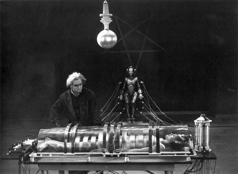
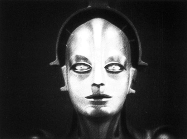
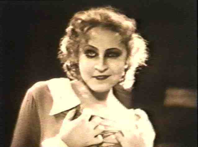
Metropolis’s visual beauty is by far its most appealing factor. The visuals are what make the film so easy and exciting to follow and they truly blow you away. To think of all the ideas and concept work that went into designing the big city alone, with all its advance technology, and all being done in 1927! It’s quite mind boggling. As well as the city they had the idea of having a robot that they made look like the prophet Maria. The design of the robot is impressive and the transformation scene is exceptional, definitely my favourite part of the film.

Transformation scene stills


Robot and Maria being prepared for transformation

lighting effects just before transformation

robot as Maria
Evil Maria causing trouble

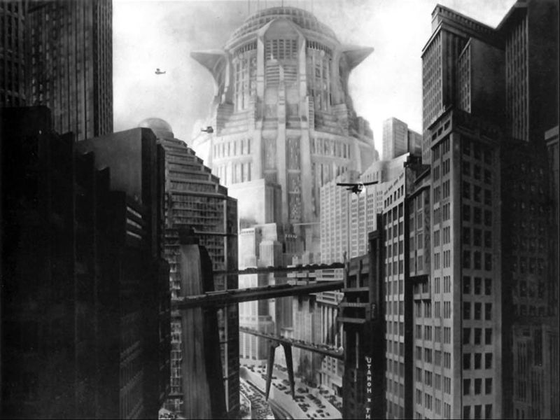
Metropolis employed 25,000 extras to create its own world, of course along with its amazing sets and eye-catching special effects. This again is an amazing thing to do in a 1920s film and it should be accredited. The sets were great works of art and to me they are another main attraction of the film. Some of the workers city sets were very outlandish but that was their purpose, to bring you into their world to give you an understanding of how things were, it makes you feel for the characters. As for the more hi tech side of the city it was also very imaginative and again that is what Lang was going for, it gives great contrast between the cities two sides and who occupy them in a very effective manner.


Modern City


Workers


Underground worker city


This is in opposition to the aims of Caligari’s set designs. The Cabinet of Doctor Caligari is set in a fictional world not based off any real world environment, making it less relative and more dreamlike. Also because Metropolis city can in some aspects be presented as a real possibility in our future, taking into consideration the films political and social messages, it makes it all the more saddening. "Like Brazil, Metropolis (Lang 1927) is not meant to portray any existing location but to exploit the unsettling possibility of being anywhere. Like Alphaville, it is designed as a believable vision of a future city".

With the city being such a spectacular design, it must have been inspiring to a lot of other architects and designers looking for ideas. Some of these designers have of course incorporated some of Metropolis’s attributes into their own work. One that has come to mind while looking closer at Metropolis is Anton Furst’s Gotham City from Batman. While this is just my own speculation I have seen many similarities in the two’s design.

Gotham City


Batman in Gotham City


Anton Furst's Gotham City artwork


Gotham City concepts, by Furst


Gotham City, Anton Furst


Metropolis


Underground City, Metropolis 1927


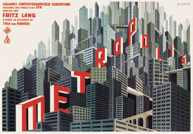
Metropolis movie poster


Metropolis City


This to me looks like Furst has been inspired by Metropolis and has made an adaptation of some sort to help create Gotham City, obviously changing a lot of the scenery and modernising it a bit.
Metropolis is an amazing film which I feel was made before its time. From the robot concepts to the mechanical sets to the vast amount of extras, this film was a trend setter of its day which I thoroughly enjoyed.


Bibliography:
http://www.imdb.com/title/tt0017136/quotes - Memorable quotes for Metropolis
http://minadream.com/timburton/AntonsBio.htm - Anton Furst background research