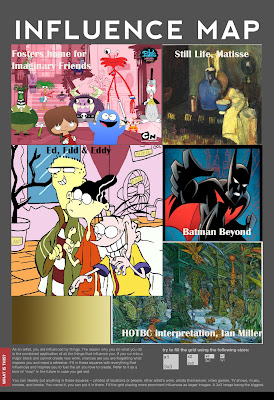
Visual Style Influence:
Foster's Home For Imaginary Friends: An old cartoon I used to watch on Cartoon Network. I like the use of colour and line in this production. There is no shading in the cartoon but the textile shapes and pattern use in the background sets give it an arty, collage feel. Also the characters are made up of simple shapes of assorted sizes, combined in different ways to make them quirky looking.
Matisse's Still Life: I chose this specific painting of Matisse's because I like the texturing. Aswell as wanting my piece to be a little toony I also want it to have some sort of painterly feel incorporated into it and this painting is a good reflection of what i have in mind.
Ed, Edd & Eddy: An alltime favourite cartoon. The reason I'm using Ed, Edd and Eddy as inspiration is because of its use of borders and outlines. If you have watched this cartoon you would know that everything has an outline but not everything is coloured and detailed properly, this only really occurs in background objects and such. Its a bit like Maya where you wouldn't have to spend as much time on something that isn't very important and wont really be looked at. Bold outline along with vibrant colour makes this cartoon stand out. Similar techniques are used in cartoons like Dexter's Lab for e.g.
Batman Beyond: A newer version of the old Batman cartoons. I'm looking at this again for use of colours but at the same time the shading and because Batman settings are usually in darker areas, like the Hall of Bright Carvings im recreating. This is also a more detailed cartoon conceptually.
Brown Gradient: These are the main colours I plan to use in my piece, i chose these because they are fitting to how the HOTBC is described.
The Hall of the Bright Carvings Interpretation, by Ian Miller: I found this while doing some research and thought it would be a good idea to keep as refernce. It's of course Millers interpretation of the HOTBC but it helps me with my development and gives me more insight to how it could look. I also like the use of space in this piece, the hall looks like it goes on forever almost.
Environment Influence:
Cross Hall, The White House: -"Connecting the State Dining Room and the East Room. To the left is the Entry Hall opening to the North Portico; to the right the Presidential Seal hangs above the entrance to the Blue Room".
I like this picture of the hall because of its perspective and open plan layout. Having beams run alongside the red carpet and archways leading to different areas creates a sense of space. I will look to this to help with my overall layout of my hall to make use of space.
The Great Hall, Hogwarts, Harry Potter: This place popped up in my mind when I first read the extract. I have an idea of making my hall like this one but the tables will be replaced with rows of carvings. I will make changes to the rafters and roof of the hall.
Artillery Cannons in Castle Hall, Gjirokastra, Albania: The reason for this photo is because it is in an old, like Gormenghast. This is also very helpful because ideally my piece will be set in a very similar location with simlar attributes like the brick walls, archways and dark setting. The light along the floor is also a reminder of how the book describes the sunlight squeezing through the gaps in the shut blinds.
St Georges Hall, Windsor Castle, by William Henry Pyne: This is a very beautiful piece of art by Pyne of St Georges Hall. It was published in London in 1819. This painting shows the hall in all its glory with the colourful paintings along the walls and ceiling, which are quite iconic of this time, but also the aged stone walls and embossed patterns. I want to somehow convert this into the context of Gormenghast. I will have an old, dusty hall as described in the book along with the bright carvings along the walls. I will replace the marble floor with old wooden planks and reshape the archways and doors. This painting has given me a lot of ideas which put forward to my final piece.
Vladislav Hall, Prague Castle: This is a more spacious hall with an old, natural feel to it. I like it because of this and that this place depicts what the inside of Gormenghast may look like, with the old dusty floorboards, low hanging chandeliers and wooden rafters.
Dracula Castle Interior, by Brian McKenzie: This is a concept design for a set in a pantomime/musical called "Dracula, the Vampire strikes back!". It is of the grand hall of Castle Dracula. What I like about this image is the perspective and the slight distortion to give it some character. I also like the lights and darks used, along with the light at the end of the hall to capture the eye. This gives the image 2 focal points which I will try to input in my own work.


No comments:
Post a Comment