Friday, 8 October 2010

2nd Photoshop lesson outcome

In this lesson my primary goal was to experiment in painting the "Photoshop" way, which is completely the other way round to which im used to working. In photoshop you tend to paint the background silhouette first and them fill it with detail...im not used to this way.

I didnt think i would come out with anything remotely recognisable, but i dont think i did too bad actually.

 Main silhouette done with a bit of shading.
 More detail added. Also have a little structure painted ontop in a new layer.
Final outcome of the days experimentation

With this experimentation i have learnt quite a bit more about Photoshop. Ive learnt how to shade not only with light and dark colours but also using the opasity tool, which i wasnt using at all before. I also learn't a bit more about how the pen tablet works.

Next lesson I will get more done in the way of transformation.

Wednesday, 6 October 2010

My Special Pen :)

Here is my development process of the pen I made in Maya

Got the basic shape of the front half down


Secondly, built the second half of the shell and placed it on the end of the pen. Also made the pen nib.

Made the clip for the pen and put it in place

This was basically the final outcome of my pen, i just needed to fix the lighting and the metal textures on the pen

Heres the final FINAL pen after adjusting the lights a bit and amending the textures.

The pen was pretty easy to me but somehow it still took longer to make then the dice. The thing i find the most difficult is lighting and texturing. I was trying to get a really shiny silver metal texture but with the lighting on i always ended up with a white colour. Another i thing i've picked up in which im not too sure about it image file types. When i rendered and saved as a TIFF, the image is more crisp but the silver colours turn bright white! But when i simply use JPEG the silver stays silver but the quality just isnt as good. If i could upload the TIFF versions you will see the difference im talking about. The renders are exactly the same (no colour alterations) but the colours come out different depending on the file types!

Anyway here is my final outcome for the pen. 

Monday, 4 October 2010

Self Portraits

Here's some self portraits i've had a go at. The first one is from a picture of myself and the second is from looking in the mirror and drawing myself. The picture is 1-2 years old :/ but i thought id still just try it.


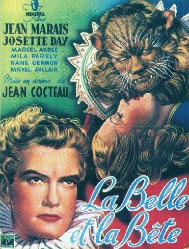
La Belle Et La Bête Review

La Belle Et La Bête
 (Beauty and the Beast)

La Belle et La Bête is a French film made in the 1946 directed by Jean Cocteau, a French poet and filmmaker. The film is a loose adaptation of the fairytale story written by Madame Leprince de Beaumont, which has the same title.
I have to say I quite enjoyed this film. The things I liked most about it were the various special effects and puppetry they used, and the progression of the storyline. For a film made in the 1940s the special effects (or cinematic tricks as they called it) used were amazing. They used smokescreens, puppetry effects (e.g. the beast’s ears moving), dreamlike effects, superimposition, slow motion, backwards playback and other effects to create the perfect atmosphere in each set. I especially liked the scene where Belle is running through the corridor in the castle in slow motion, although it’s a simple touch it really does well to captures the feeling of mixed emotions she’s having.
La Belle running through the corridor of candles in slow motion.


Here’s a quote from filmcritic.com talking about the plot of the film
This is the main thing I like in terms of storyline about this film. They make a beautiful woman fall in love with a beast of a man not out of fear or sympathy, but for who he actually is. However in the film it looked to me like she fell for him entirely AFTER he turns into a prince and not before, which is what I didn’t like and thought spoilt the ending a bit. I was a little disappointed because why not let her fall in love with the beast and be done with it, instead of making him magically rise from the floor as a prince and THEN be whisked away into the sunset happily ever after? This is just my opinion on what I would have preferred to see so I’m sure others will disagree, but I feel it’s just too cliché for the woman to be beautiful and the man to be handsome all the time. Also there are little mottos in this film like “never judge a book by its cover” for instance, but with the ending how it was it in some ways makes these things meaningless.  I think this quote hints where I’m coming from…
Anyway moving on, I think this film was very creative when it came to setting the scene in the castle. I especially like the idea of having random arms that pop out from the wall holding the candles instead of just normal chandeliers. I think details like these really capture the moment while watching a film, even the small details such as the flowers and bushes that conceal hidden pathways; it all really brings you into their world.


La Belle Et La Bête’s creativity obviously strives towards perfection in its time, if you wish to be taken "someplace else", don't miss it. However If you watch the movie for plot and character development, you'll be disappointed. The reason I say this is because the film is just a fairy tale love story, there is no real plot and the beast is just a man in a suit (sorry to burst anyone’s bubble). None the less the film is still great in conjunction to its visuals and emotion, you could say it is more of a work of art then a film based on structure and plotlines. My overall conclusion is that I thoroughly enjoyed the film, the special effects were brilliant and I think this was made well before its time. This film is easily watchable to this day without it being boring of lacking in quality.

Sunday, 3 October 2010

Hand Study

A sketck of my hand

Quick concept sketches of my hybrid designs

Here are some little sketches i done using different attributes of the bald eagle and myself. I tried a variation of combinations to see what i liked most. I also drew the character in different poses.

This was just something i tried out to see how it looked. I was going for the look of an eagle when it glides down and gets ready to catch its prey, but instead made the body a human squatting on one knee. The wings body and tail feathers are ofcourse eagle but the head, arms and legs are human. The idea i had in mind for this fusion was for it to be cut straight down the middle, so looking from a side view the front would be human and the back eagle( i might do a drawing of this so it makes more sense). 


This one was just me trying to be a bit more optimistic and not so obvious in my approach. I decided to give the eagle giant hands on his back which he uses to fly, only the arms are reformed so they can bend correctly and actually be useful....why not?

(Oh and yes incase you were wondering, i did do the hands and fingers and stuff all the wrong way round but oh well..)


More experimentation with different body parts. The thing I like most about the design is the idea of having hands as feet. I put the eagle heads on the end of the wings so that he would be able to catch prey a little easier, the downside is that flying will be more of a challenge.

The drawing on the right was simply a drawing of how the eye roughly looks ( I did this on the train)

More concepts.


I tried an on-all-fours approach this time, I think this makes the hybrid look more wild and animal like. The design portrays that aswell as it looking like a man-eagle hybrid, this thing also acts more like a mixture of mammal and bird in terms of its animal behaviour, the way it moves, hunting etc. I havent just picked for it to act one way or the other.

Saturday, 2 October 2010

1st Photoshop Character Painting


I basically just drew this using a thin paintbrush and i concentrated on the outline. I then chose a softer brush and used a light grey to shade, gradually getting darker in certain areas.